A responsive logo is one with design elements that adapt slightly depending on the device or screen size on which they are displayed without compromising the brand identity.
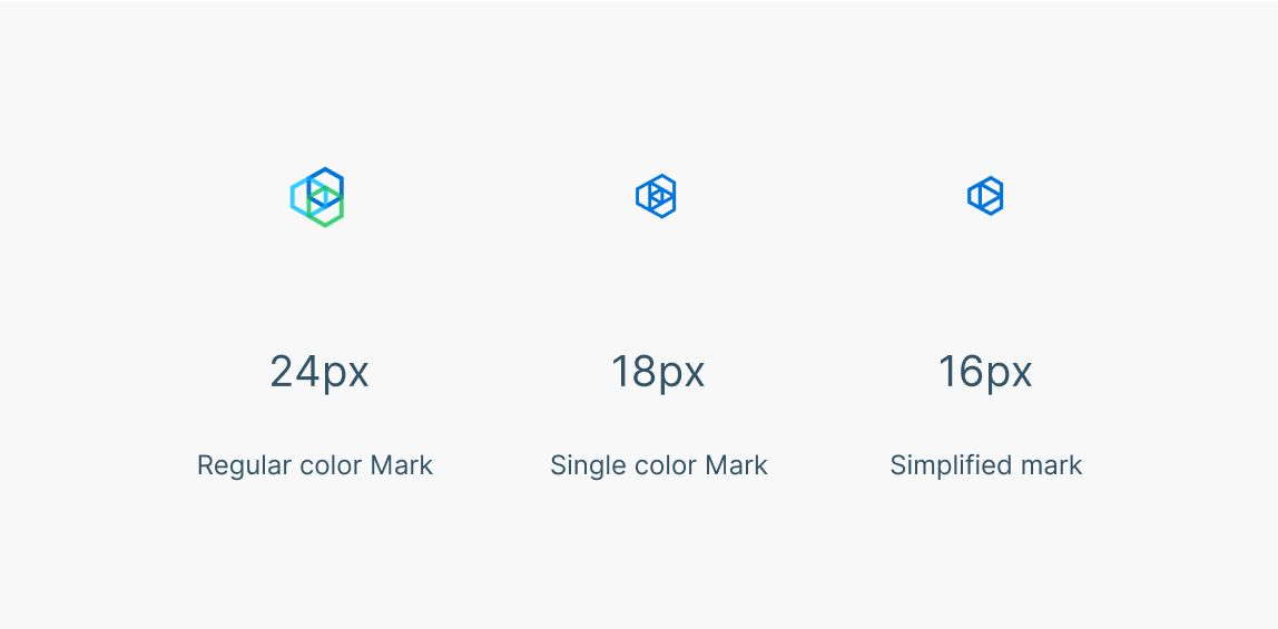
Design elements that might be replaced or changed may include icons or symbols, company names and slogans, colors, backgrounds, outlines, and other small details.
Take a look at the below images to get an idea of how a logo might change orientation (horizontal vs vertical) and how it might omit certain details to look clearer on smaller displays.
For more info please check the original blog post A step‑by‑step process for creating responsive logo designs by Dribble.

Responsive Different Logo Sizes
Responsive Simplification

Responsive Vertical Version
Founder of SOFTKUBE, lead developer, and getting things done addict. Passionate about open source, user interface design, business development, and the tech world.
A small team of experts developing simple, usable, and high-quality web solutions. We blog about business, entrepreneurship, web development, and technology.
Displaying the Current Running Process and its Arguments in the Window Title Bar of WezTerm
How to Inspect Dynamic and Disappearing UI Elements with the DevTools Debugger
Gaining Access to a Legacy Google Apps Account When Phone Verification Fails
Custom Theme Migration from Drupal 9 to Drupal 10
Business Cheat Sheets CLI Code Design Development Downloads Drupal Email Google Apps HID Keyboards Multilingualism Open Source Philosophy PHP Pointing Devices Productivity Quotes Science Security SEO Technology Thoughts Windows Zend Framework